Normalization and Clustering (Tabula Muris)
Download Tabula Muris dataset from HERE and annotation from HERE.
library(gficf)
library(ggplot2)
# See function man page for help
?gficf
# Common pipeline to use that goes from normalization to clustering
# Step 1: Nomrmalize data with gficf
data = gficf::gficf(M = readRDS("~/work/current/scRNA_normalization_paper/RData/TabulaMuris.10x.mouse.RAW.rds"),cell_proportion_max = 1,cell_proportion_min = .05,storeRaw = T,normalize = T)
# Step 2: Reduce data with Latent Semantic Anlysis before to apply t-SNE or UMAP
data = gficf::runLSA(data = data,dim = 50)
# Alternative Step 2: Reduce data with Principal Component Analysis before to apply t-SNE or UMAP
# data = gficf::runPCA(data = data,dim = 50)
# Step 3: Applay t-SNE on reduced data and plot cells
data = gficf::runReduction(data = data,reduction = "tsne",seed = 0,nt=4)
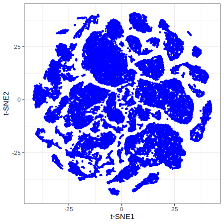
p1 = gficf::plotCells(data = data) + xlab("t-SNE1") + ylab("t-SNE2")
print(p1)
# Alternative Step 3: Applay UMAP on reduced data
# data = gficf::runReduction(data = data,reduction = "umap",seed = 0,nt=4)
# gficf::plotCells(data = data)
# Step 4: Cell clustering using Phenograph algorithm
# We use louvian Louvian with modularity optimization.
# The resolution parameter is usede to fine-tune the final number of clusters.
# ?clustcells for details.
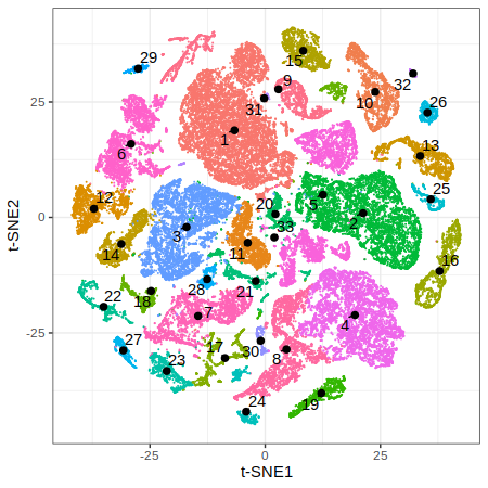
data = gficf::clustcells(data = data,from.embedded = F,dist.method = "manhattan",nt = 4,k = 50,community.algo = "louvian 2",seed = 0,resolution = .25, n.start = 25, n.iter = 50)
# Step 5: Visualize cells by identified clusters
p2 = gficf::plotCells(data = data,colorBy="cluster",pointSize = .05) + xlab("t-SNE1") + ylab("t-SNE2")
print(p2)
| Plot p1 (t-SNE) | Plot p2 (Colored by clusters) |
|---|---|
 |
 |
# Additional steps: add annotation to cells and plot it.
# Additional steps: add annotation to cells and plot it.
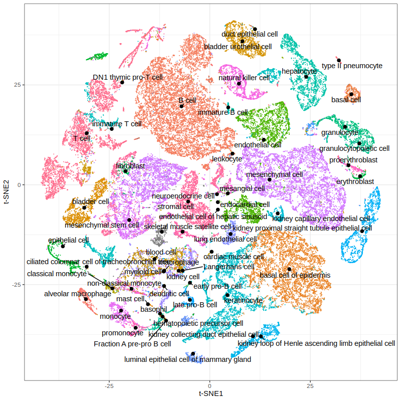
info = readRDS("~/work/current/scRNA_normalization_paper/RData/TabulaMuris.10x.mouse.annotation.rds")
data$embedded$tissue = info$tissue[match(rownames(data$embedded),info$id)]
data$embedded$subtissue = info$subtissue[match(rownames(data$embedded),info$id)]
data$embedded$cell_ontology_class = info$cell_ontology_class[match(rownames(data$embedded),info$id)]
p3 = gficf::plotCells(data = data,colorBy="cell_ontology_class",pointSize = .05) + xlab("t-SNE1") + ylab("t-SNE2")
print(p3)
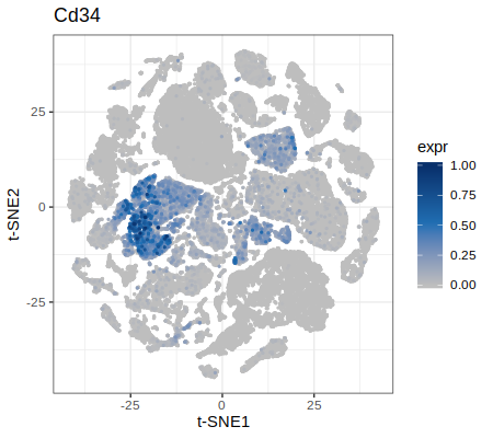
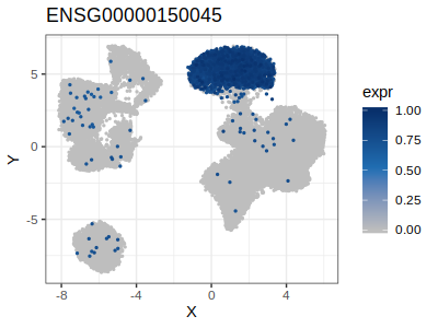
# Plot the relative expression of selected genes
p = plotGenes(data = data,genes = c("Cd34","Cd8a"))
p4 = p[[1]] + xlab("t-SNE1") + ylab("t-SNE2")
print(p4)

p5 = p[[2]] + xlab("t-SNE1") + ylab("t-SNE2")
print(p5)
 |
 |
How to embedd new cells in an existing space
Download PBMCs dataset from HERE.
library(gficf)
library(ggplot2)
library(plyr)
# Common pipeline to use that goes from normalization to clustering
# Step 1: load data and split in training and test set
M = readRDS("/path/to/Purified.PBMC.RAW.rds")
set.seed(0)
ix = sample(x = 1:ncol(M),size = 1000)
M.test = M[,ix]
M.train = M[,-ix]
rm(M,ix);gc()
# Step 2: Nomrmalize the training set data with gficf
data = gficf::gficf(M = M.train,cell_proportion_max = 1,cell_proportion_min = .05,storeRaw = F,normalize = T)
# Step 3: Reduce data with Latent Semantic Anlysis before to apply t-SNE or UMAP
data = gficf::runPCA(data = data,dim = 50)
# Step 4: Applay UMAP on reduced data and plot cells
# Note: You can pass more parameters directly to umap. a and b are specific parameters controlling the embendding.
# see ?umap for what a,b,n_neighbors and metric parameters are.
data = gficf::runReduction(data = data,reduction = "umap",seed = 0,nt=4,a=2,b=2,n_neighbors=30,metric="manhattan",verbose = T)
# Add cell type info that is contained in the name of each cell
data$embedded$cell.type = unlist(sapply(strsplit(x = rownames(data$embedded),split = ".",fixed = T),function(x) x[1]))
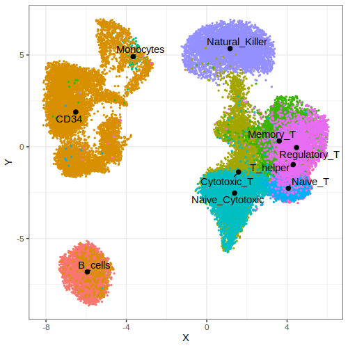
# Plot cells by cell type
p1 = gficf::plotCells(data = data,colorBy = "cell.type")
print(p1)
Now that we have a UMAP embedded space for the cells of the training set, we can try to add the one contained in the test set and see where they are placed.
# Step 5: We can now embed the new cell in the already existing space and predct thei type
data = gficf::embedNewCells(data = data,x = M.test,nt = 6,seed = 0)

# Let's add the know cell type for each predicted cell
data$embedded$cell.type = unlist(sapply(strsplit(x = rownames(data$embedded),split = ".",fixed = T),function(x) x[1]))

# Step 6: Plot results. Embededd cell are shown as triangle and colored according to their original cell type.
p2 = ggplot(data = data$embedded,aes(x=X,y=Y,color=cell.type)) + geom_point(aes(shape=predicted,size=predicted)) + theme_bw() + scale_shape_manual(values = c(20,17)) + scale_size_manual(values = c(.1,3))
print(p2)
| Plot p1 (by cell type) | Plot p2 (cell repositioning) |
|---|---|
 |
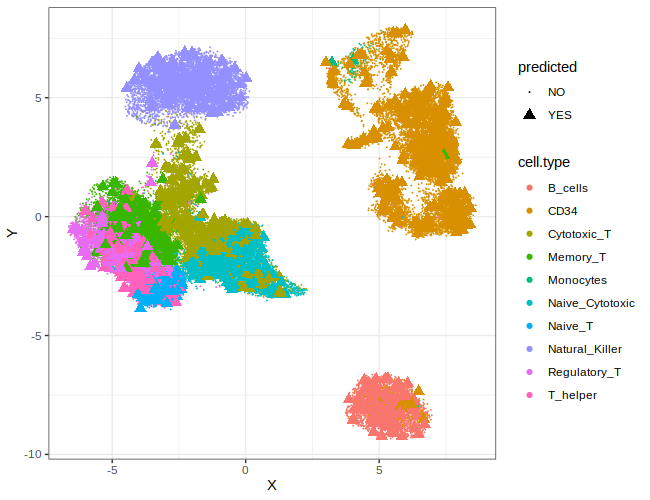 |
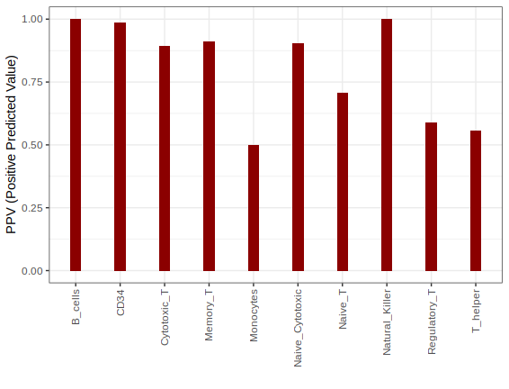
We can also try to classify new ebedded cells and compute accurancy of the classifier. Cells are classified using K-nn method after cell profiles is trasformed with GF-ICF weigths estimated on the training set and multiplied for gene loading of PCA/LSA transformation.
# Step 7: We can now try to classify added cells from the test set using cells in the training set.
#
# we just need to specify classes (i.e. cell types) of cells in the training set and the number of k-nn to use.
cl = unlist(sapply(strsplit(x = colnames(data$gficf),split = ".",fixed = T),function(x) x[1]))

# than we can call classifier. Predicted types are in the coloumn pred of the returned dataframe.
df.pred = gficf::classify.cells(data = data,classes = cl,k = 7)

# Let's compute classification precision [TP/(TP+FP)]
df.pred$real_cell_type = unlist(sapply(strsplit(x = df.pred$cell.id,split = ".",fixed = T),function(x) x[1]))

# Overall precision is 0.888
print(sum(df.pred$pred==df.pred$real_cell_type)/nrow(df.pred))

# Precision by cell type
ppv.stat = ddply(df.pred,"real_cell_type",summarise,acc=sum(real_cell_type==pred)/length(real_cell_type))
p3 = ggplot(data = ppv.stat,aes(x=real_cell_type,y=acc)) + geom_bar(stat = "identity",width = .25,fill="darkred") + theme_bw() + theme(axis.text.x = element_text(angle = 90, vjust = 0.5, hjust=1)) + ylab("PPV (Positive Predicted Value)") + xlab("")
print(p3)
Since the nearest neighbor index memory is owned by the C++ code and is opaque to R, the saveRDS and loadRDS don’t work with uwot models. Hence, to preserve and use the umap/tumap model across different R sessions, please save (and load) the gficf data object with the corrsponding functions saveGFIC (or loadGFICF).
# save gficf object
saveGFICF(data, file = "path/to/save/gficf_data")
How to perform GSEA to identify active pathways in each cluster
Download PBMCs dataset from HERE.
Download gmt file containing the gene sets from HERE.
library(gficf)
library(ggplot2)

# Example on how use GSEA for the identification
# of active pathways for each identified cluster

# Step 1: load PBMC dstsdet
pbmc = readRDS("/path/to/Purified.PBMC.RAW.rds")

# Step 2: Nomrmalize the training set data with gficf
data = gficf::gficf(M = pbmc,cell_proportion_max = 1,cell_proportion_min = .05,storeRaw = T,normalize = T)
rm(pbmc);gc()

# Step 3: Reduce data with PCA before to apply t-SNE or UMAP
data = gficf::runPCA(data = data,dim = 50)

# Step 4: Applay umap on reduced data and plot cells
# see ?umap for what a,b,n_neighbors and metric parameters are.
data = gficf::runReduction(data = data,reduction = "umap",seed = 0,nt = 2,a=2,b=2,n_neighbors=30,metric="manhattan")

# cell type is contained in the name of each cell
data$embedded$cell.type = unlist(sapply(strsplit(x = rownames(data$embedded),split = ".",fixed = T),function(x) x[1]))
p1 = gficf::plotCells(data = data,colorBy = "cell.type")
print(p1)

# Step 5: Cluster cells with phenograph method and visualize the results
# see ?clustcells for more details
data = gficf::clustcells(data = data,dist.method = "manhattan",nt = 2,k = 50,community.algo = "louvian 2",seed = 0,resolution = .75,n.start = 25,n.iter = 50)
p2 = gficf::plotCells(data = data,colorBy = "cluster")
print(p2)
| Plot p1 (by cell type) | Plot p2 (by clusters) |
|---|---|
 |
 |
Now that we have identified clusters we can use GSEA to identify pathway activity
across cells of the same cluster. Briefly Gene Ranks are first summedd across cells
of the same cluster and then GSEA is performed.
In this example we use the 50 hallmarks pathways from mSigDB. However You can find additional gene sets files (gmt) on
mSigDB HERE. Only gmt files with official gene symbols are actually supported.
Tips: Use different combination of convertToEns and convertHu2Mm in the function runGSEA to convert gene set files in the one you need before to perform GSEA. Choose the right combination to match identifier you are using to rapresent genes.
Examples:
convertToEns = T and convertHu2Mm = F –> human symbols are converted to human ensamble id
convertToEns = T and convertHu2Mm = T –> human symbols are converted to mouse ensamble id
convertToEns = F and convertHu2Mm = T –> human symbols are converted to mouse symbols
convertToEns = F and convertHu2Mm = F –> no conversions, original symbols in the gmt file are used
# Step 6: Run GSEA to identify active pathways in each group of cells
# ?runGSEA for details
gmt.file.path = "/path/to/h.all.v6.2.symbols.gmt"
data = gficf::runGSEA(data = data,gmt.file = gmt.file.path,nsim = 10000,convertToEns = T,convertHu2Mm = F,minSize = 15,nt = 4)
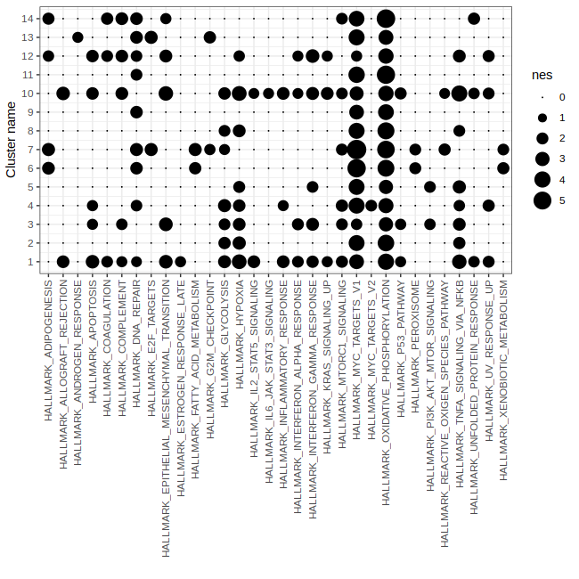
# Step 7: Plot GSEA results to show significant pathways in eac cluster
# Note: To be comparable across pathways the Normalized Enrichement Scores (NES) are plotted.
p3 = gficf::plotGSEA(data = data,fdr = .1)
print(p3)
# Note: Info about pathways and number of used genes are in data$gsea$stat dataframe
print(head(data$gsea$stat))
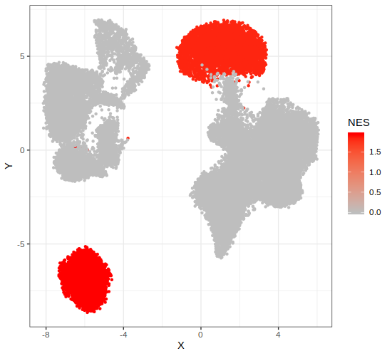
# Step 8: Plot pathway activity across cells in the embedded space
p4 = gficf::plotPathway(data = data, pathwayName = "HALLMARK_PI3K_AKT_MTOR_SIGNALING",fdr = .1)
print(p4)
| Plot p3 (GSEA results) | Plot p4 (PI3K AKT MTOR pathway activity) |
|---|---|
 |
 |
Find Marker Genes
GFICF package try to identify marker genes across clusters performing Mann-Whitney U test with continuity correction.
Briefly DE genes of each cluster are identified comparing the expression of each gene in each cluster versus the all the others. Below you can find and example of how do it and plot results.
The first five steps are the same of the previus section How to perform GSEA to identify active pathways in each cluster in which you perform dimensionality reduction and identify cluster. So for semplicity I will assume you have already performed these steps and I will start from the sixth step consisiting in identifing marker genes of each cluster.
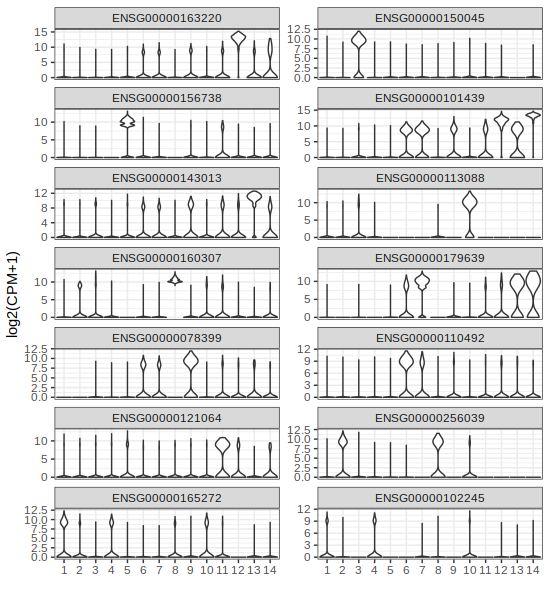
# First Identify marker genes across cluster of cells
# see ?findClusterMarkers for details
data = gficf::findClusterMarkers(data = data,nt = 4,hvg = T,verbose = T)

# results are in data$de.genes
# Only genes with FDR < 5% are retuned and they are already sorted by log2 fold change
head(data$de.genes)

# Lets add symbols to data$de.genes dataframe
# see ?ensToSymbol for details
data$de.genes = gficf::ensToSymbol(df = data$de.genes,col = "ens",organism = "human")

# Let's cosider as marke the most upregulated gene of each cluster
markers = data$de.genes[!duplicated(data$de.genes$cluster),]

# We can now plot them with Violin plot
gene2plot = markers$ens
p3 = gficf::plotGeneViolin(data = data,gene = gene2plot,ncol = 2)
plot(p3)

# If we want to use symbols instead of ensamble, just use symbols as names of the vector of ensamble ids
names(gene2plot) = markers$symb
p4 = gficf::plotGeneViolin(data = data,gene = gene2plot,ncol = 2)
plot(p4)
| Plot p3 (Marker Violin ensID) | Plot p4 (Marker Violin symbols) |
|---|---|
 |
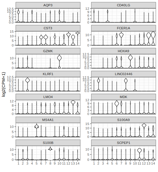 |
Remeber that if you want to plot the expression of a gene (ore more than one) in the embedd space you can use the function plotGenes.
Looking at the results above, for example cluster 13 that correspond to natural killer cell is charachterized by the high expression of KLRF1 (Killer Cell Lectin Like Receptor F1) while the cluster 5 that correspond to B-cell is characterized by high expression of MS4A1 (alias B-Lymphocyte Antigen CD20)
p.list = gficf::plotGenes(data = data,genes = gene2plot[c("KLRF1","MS4A1")],log2Expr = T)
p5 = p.list[[1]]
plot(p5)

p6 = p.list[[2]]
plot(p6)
| Plot p5 (KLRF1) | Plot p6 (CD20) |
|---|---|
 |
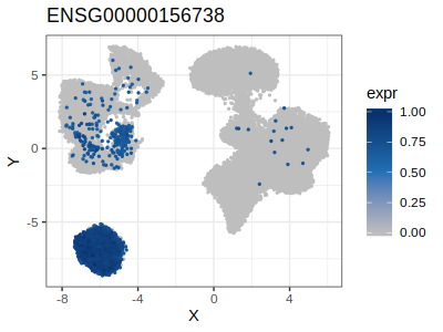 |